
Home / Blog / Print File Preparation Guide: Bleed, CMYK and Resolution
Design & BrandingPrint File Preparation Guide: Bleed, CMYK and Resolution
Most printing problems start in the file, not at the press. This print file preparation guide shows what to check so your flyers, cards and brochures print as you approved them.
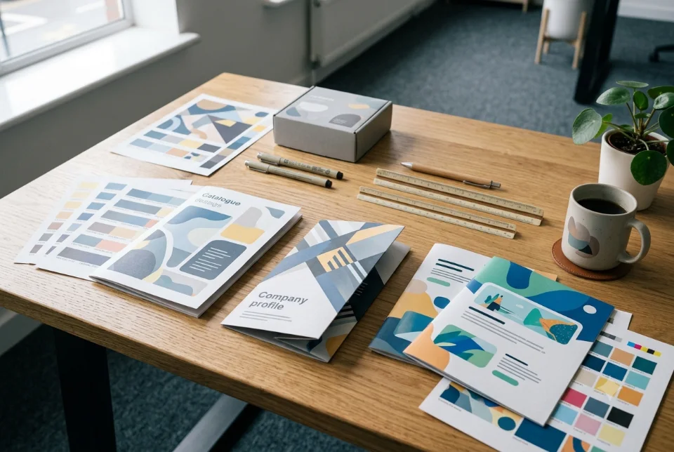
A good print file preparation guide comes down to a handful of checks: add bleed beyond the trim edge, keep important text inside a safe area, use images of about 300 dpi at the printed size, convert colours for print, and send a PDF with fonts embedded or outlined. Get these right and your printer can run the job without calling you back. This print file preparation guide explains each step in plain language for Indian business owners who send flyers, brochures, cards and posters to a press.
Why print files get rejected or look different
A screen shows glowing light, while paper reflects it. A file that looks perfect on your phone can print darker, duller or with a thin white line at the edge. Most of these surprises come from a short list of causes: missing bleed, text too near the edge, low-resolution pictures, wrong colour mode, and fonts that were not included.
Printers in India handle many jobs a day, and a busy press may print your file as received if it opens without errors. That is not the same as checking it for you. Treat the file as your responsibility, ask the printer for its specification, and use this print file preparation guide as a checklist before you send anything.
Trim, bleed and safe area explained
Three terms cover most layout problems. The trim size is the final size of the cut piece, for example A5 at 148 x 210 mm. The bleed is extra artwork that extends past the trim line, so that tiny cutting shifts do not leave a white edge. The safe area is the inner margin where text and logos should stay, so nothing important is cut off.
- Trim: the finished size after cutting.
- Bleed: background colours, photos and patterns that touch the edge should continue outward. Many presses ask for around 3 mm on each side, but confirm with your printer.
- Safe area: keep text, phone numbers, QR codes and logos inside a margin, commonly 3 to 5 mm inside the trim, or more for thick bound items.
If your design has a plain white background and nothing touches the edge, bleed matters less, but adding it does no harm. If any colour or photo reaches the edge, bleed is essential. Cutting is a mechanical process, so a small shift of a millimetre or two is normal, and bleed is what protects you from it.
Common sizes to set up before you design
Start the document at the right size, because scaling a finished design later can blur images and break the margins. Standard paper sizes are widely used in India, and the dimensions below are the usual ones.
- A6: 105 x 148 mm
- A5: 148 x 210 mm
- A4: 210 x 297 mm
- A3: 297 x 420 mm
- A2: 420 x 594 mm
Poster printers also quote inch sizes such as 12 x 18, 18 x 24 or 24 x 36 inches, and visiting cards vary by vendor. Standees, flex banners and hoardings have vendor-specific dimensions, so always ask for the exact artboard size and bleed. Our flyer and poster design services start with this size decision, since it affects layout and the print cost.
Want this done for you? Ragnar Studios handles Flyer & Poster Design. See how it works or get a free quote.
CMYK vs RGB: what changes on paper
Screens mix red, green and blue light (RGB). Most commercial presses print with cyan, magenta, yellow and black inks (CMYK). The range of colours that ink can reproduce is smaller than a bright screen, so vivid greens, blues and neon shades may look flatter in print.
The practical advice is to work in or convert to a print colour mode before final export, and to review the converted colours rather than assume they will match your screen. Some printers accept RGB files and convert them, but the result is then outside your control. Ask what the press prefers and what colour profile it works with, if any.
- For print jobs, prepare the final artwork in CMYK unless your printer says otherwise.
- For websites, social media and WhatsApp, RGB is correct.
- Keep a separate digital version rather than reusing a print file online.
Even then, colour will never be identical across a phone, a laptop and paper. Treat a printed proof as the reference, not the screen.
Resolution: why 300 dpi at final size matters
Resolution is how many dots or pixels fit in an inch. A common rule for sharp printed photos is about 300 dpi at the size they will be printed. A picture that is 1200 pixels wide can print at roughly 4 inches wide at 300 dpi. If you stretch it to 8 inches, it drops to about 150 dpi and may look soft.
- Check the pixel size of each image against its printed size on the page.
- Use the original photo, not a screenshot or a version saved from WhatsApp, which is compressed.
- Do not enlarge a small image to fix it, because enlarging does not add detail.
- Large posters viewed from a distance can tolerate lower resolution, but ask the printer for guidance.
- Logos should be vector files where possible, so they stay crisp at any size.
Images downloaded from a website are usually made for screens at low resolution, and often carry licence limits. If you are not sure whether you can print a picture, ask the owner or use an image you have the right to use commercially.
Fonts, text and black: small details with big effects
Fonts are a frequent reason a printed job differs from the approved design. If the printer's computer does not have your font, it substitutes another one, which changes spacing and can break lines. To avoid this, embed fonts in the PDF or convert text to outlines (shapes) before sending. If you outline text, keep an editable copy of the original file for later changes.
Black needs thought as well. Small body text is best set in a single black ink, because mixing several inks for tiny letters can cause slight misalignment and fuzzy edges. Large solid black areas can look richer when built from black plus other inks, known as rich black. Rich black is not suitable for small text. Your printer can tell you the recommended mix for their press.
- Avoid very thin lines and very small text, especially in light colours on dark backgrounds.
- Check that Hindi and regional-language characters look correct in the final PDF, since some conversions break conjunct characters.
- Do not use pure screen black behind a logo and expect it to match the black of a nearby photo.
PDF, PDF/X and the file you should send
For most commercial print, a PDF is the safest format because it keeps fonts, images and layout together. PDF/X is a family of print-oriented PDF standards. It limits some features, such as unembedded fonts and certain colour setups, so that the file behaves predictably at the press. Some printers specifically ask for it, others accept a normal high-quality PDF.
Ask your printer which one they want. Send the PDF with the correct page size, bleed, and, if requested, crop marks. Do not send a Word file, a PowerPoint file or a phone screenshot unless the printer specifically accepts it, because layouts can shift when they are opened on a different computer. For a multi-page brochure, discuss page order and binding with the printer, as our PDF, brochure and catalogue design service does for catalogues.
Spot colours, briefly
Most small jobs use CMYK only. A spot colour is a special pre-mixed ink, often chosen when a brand colour must stay consistent or when a metallic or fluorescent shade is needed. It costs more and is not offered by every press. If your logo uses a named brand colour, ask the printer whether they can match it in CMYK, and approve a proof. Do not add spot colours to a file unless the printer asked for them, because unwanted extras can create extra plates or conversion trouble.
Checking proofs before the full run
A proof is a sample or preview of how your job will print. A digital proof (PDF) helps you check text and layout. A physical or hard proof helps you check colour. For a small job, ask for a single sample print of the actual paper if the printer can provide it.
- Read every word again, including phone numbers, addresses, dates and prices.
- Scan any QR code with more than one phone.
- Look at the edges for missing bleed or text too close to the trim.
- Compare colours with a printed brand sample, if you have one.
- Approve in writing, so there is a clear record of what was signed off.
The paper also changes the look. Glossy and matte coatings, and uncoated paper, show the same ink differently, so test on the stock you plan to use. For small business cards, our guide on how to design a business card covers common finishes.
Common reasons presses reject or reprint a file
- No bleed, leaving thin white edges after cutting.
- Text in the unsafe zone, so letters are trimmed.
- Low-resolution images, which print soft or pixelated.
- Missing fonts, causing replaced typefaces.
- Wrong colour mode, leading to surprising colour shifts.
- Wrong page size or page order, especially for multi-page files.
- Transparency or effects that behave differently in older print systems.
- Unflattened or hidden layers, if you send an editable file instead of a PDF.
A printer may fix small issues for you, but ask first. Printer corrections are done quickly and may not match your intent, so it is safer to send a clean file than to rely on a quick repair.
Print file preparation guide: the pre-flight checklist
Pre-flight is a final check done before the file goes to the printer. Run through this list every time, and tick each line.
- Document size matches the finished trim size confirmed with the printer.
- Bleed added on all sides (commonly 3 mm), with background artwork extended into it.
- Text, logos and QR codes sit inside the safe margin.
- Images are the right resolution at final size, and no screenshots are used.
- Colour mode is set as the printer asked, and colours have been reviewed after conversion.
- Fonts are embedded or converted to outlines, and regional scripts are checked.
- Small text is a single black, and no tiny reversed text on busy backgrounds.
- Spelling, phone numbers, addresses, prices and dates have been proofread by two people.
- PDF exported as per the printer's specification, such as PDF/X if asked.
- File name is clear, quantity and paper are confirmed, and proof approval is recorded.
If you do not want to handle these details yourself, brief a designer clearly using our guide on how to brief a graphic designer, and ask for print-ready files as part of the scope. For related reading on layouts, see brochure design tips for Indian businesses.
Frequently asked questions
What is bleed in printing and how much do I need?
Bleed is extra artwork that extends beyond the trim line so that small cutting shifts do not leave white edges. Many presses ask for about 3 mm on every side, but requirements vary, so confirm with your printer. Extend backgrounds and photos into the bleed, and keep text away from the edge.
Should I send my print file in CMYK or RGB?
For commercial printing, prepare the final artwork in CMYK unless your printer says it accepts RGB and converts it. RGB is meant for screens, so use it for websites and social posts. Review colours after conversion, because bright screen shades may look duller on paper, and ask for a proof.
Is 300 dpi always necessary?
About 300 dpi at the final printed size is a common guide for sharp photos on flyers, brochures and cards. Large posters and banners viewed from far away can use lower resolution. Ask your printer for guidance, and avoid enlarging small images, because enlarging does not add real detail or sharpness.
What is PDF/X and do I need it?
PDF/X is a group of print-focused PDF standards that limit features which can cause problems at the press, such as missing fonts. Some printers request it, and many accept a good standard PDF. Ask which they prefer, and export with the right page size, bleed and embedded fonts.
Should I outline fonts or embed them?
Either approach can work, as long as the text prints correctly. Embedding keeps text editable inside the PDF, while outlining turns letters into shapes so they cannot be replaced. Whichever you choose, check the final PDF carefully, especially Hindi and regional-language text, and keep an editable original copy.
What is rich black and when should I use it?
Rich black is black built from black ink plus other inks, which can look deeper in large solid areas. It is not recommended for small text, because multiple inks can misalign and blur the edges. Use single black for body text, and ask your printer for their preferred mix for large black backgrounds.
Why do my printed colours look different from my screen?
Screens emit light and cover a wider range of colours, while ink on paper reflects light and has a smaller range. Paper type, coating and the press also change the look. Use a printed proof as the reference, and do not rely only on how the file looks on your phone.
Can I send a Word or PowerPoint file to the printer?
Some printers accept them, but layouts, fonts and spacing can shift when opened on another computer, and bleed is hard to set. A print-ready PDF is safer. If you only have an office file, ask the printer first, or have a designer export a proper PDF for you.
Want flyers and posters delivered as print-ready files with bleed and the right colour setup? See our flyer and poster design services and share your requirements for a custom quote.
Free quote
Tell us about your flyer or poster
Fill this short form and send it on WhatsApp. We reply with questions or a quote. Nothing is charged on the website.
- Takes about two minutes
- Goes straight to Ragnar Studios on WhatsApp
- Prefer email? Write to info@ragnarstudio.com
Ready to start Print File Preparation Guide: Bleed, CMYK and Resolution?
Tell us what you need. We reply on WhatsApp with questions, next steps and a quote.