
Home / Blog / Brand Guidelines: What to Include, Who Needs Them and How to
Design & BrandingBrand Guidelines: What to Include, Who Needs Them and How to Keep Them Useful
What a brand guidelines document contains, from logo rules to voice and templates, plus who needs one, how long it should be and how teams and vendors use it.
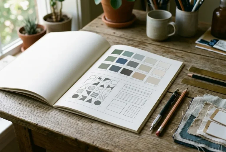
Your logo is on the signboard, the Instagram page, the invoice and the packaging, and every one of them was made by a different person. Brand guidelines are the short document that stops those pieces from drifting apart. In plain terms, brand guidelines are a written rulebook for how your business looks and sounds: how to use the logo, which colours and fonts to use, what kind of images fit, how to write, and what to avoid. This guide explains what to include, who actually needs one, how long it should be, and how to keep it useful after it is made.
Related reading and services: brand guidelines design, branding agency in India, brand identity design and choosing brand colours and fonts.
What this document is, and what it is not
A brand book, also called a brand manual, is a reference document. They do not create your brand; they record the decisions already made so other people can follow them without asking you every time. If you are still working out what your brand stands for, start with our brand identity guide for small business and come back here once the basics are settled.
It also helps to separate three things people often mix up. A logo is one mark. A brand identity is the full visual and verbal system around it. The guidelines are the instructions for using that system correctly. We explain the first two in a separate piece on brand identity vs logo.
Why a rulebook matters
People rarely remember your logo in isolation. They remember a general feeling built from repeated, consistent signals: the same blue, the same type of headline, the same tone in a WhatsApp message. Consistency makes a small business look more established than it may be, and it makes a large one look like a single company instead of ten departments.
Brand guidelines are the rules that keep a business looking the same everywhere. Good brand guidelines cover logo use, colours, fonts, imagery and tone of voice.
There are also practical gains:
- Faster work: a designer, printer or social media person can start without ten clarification calls.
- Fewer reprints: the right file, colour values and sizes are written down, so a signboard or brochure does not come out in the wrong shade.
- Easier delegation: when someone new joins, they follow the document instead of copying whatever old file they find.
- Protection of the logo: rules stop people from stretching, recolouring or squeezing it into awkward spaces.
Be honest about the limits too. Guidelines do not make a weak product look good, and they do not replace marketing. They only keep what you already have consistent.
What to include
The exact contents depend on your business, but most useful documents cover the following sections. Each one is described below in the order people usually need it.
Brand story, purpose and personality
Start with half a page: what the business does, who it serves, what it stands for, and three or four personality words such as warm, direct, careful or playful. This gives every later rule a reason. A rule that says "use rounded fonts" makes sense when the personality is friendly, and it helps a new designer decide on cases the document does not cover.
Logo usage
This is the section most people open first. It should show the primary logo, a stacked or horizontal alternative if you have one, a small icon or favicon version, and one-colour versions in black and white for stamps, newspaper ads and embroidery. Include the file formats that go with each use, for example vector files for print and PNG with a transparent background for screens. If you are still designing the mark itself, our logo design tips for small business cover what makes a logo hold up in real use.
Clear space and minimum size
Clear space is the empty margin that must stay around the logo, so text or photos never crowd it. A common method is to measure it using a part of the logo itself, such as the height of a letter, so the rule scales with the logo. Minimum size says how small the logo may be printed or shown before details become unreadable, for example a width in millimetres for print and in pixels for screens. These two rules solve a surprising number of everyday arguments.
Colour palette
List your main colours, supporting colours and neutral shades, with values for each way you will use them: HEX or RGB for screens, CMYK for print, and a Pantone reference if you print with spot colours. Say which colour dominates and which is only for small accents, and show approved text and background combinations that are easy to read. Screen colours often print duller, so mention that a printed proof should be checked. If your palette is not final yet, read how to choose brand colours and fonts first.
Typography
Name the fonts for headings and body text, the weights you use, and a fallback font for places where the main one is not available, such as a plain email or a basic document. Give simple size and spacing guidance: how large a headline is compared with body text, and how much space between lines. Check the font licence too, because some fonts are free for personal use but need a paid licence for business or commercial printing.
Imagery, icons and graphic elements
Describe what kind of photos fit the brand: real people or studio shots, bright or moody, close-up or wide. Show examples of what is on-brand and what is not. Add rules for icons (line or filled, one thickness), patterns, borders, illustrations and any shapes taken from the logo. For product businesses, include how to light and crop product pictures so a catalogue or online store looks uniform.
Voice and tone
Good rules are not only visual. Write a short note on how the brand speaks: formal or friendly, short sentences or detailed, whether you use Hindi, English or a mix, and how you greet customers on WhatsApp. Add a few sample lines, like a caption, an email opening and a reply to a complaint. Also list words you prefer and words you avoid. This helps whoever answers messages when you are not around.
Templates and applications
Show the system working on real items: visiting card, letterhead, invoice, email signature, social media post, presentation, packaging label, signboard, uniform or vehicle branding, depending on what you actually use. If you print paperwork, our stationery design guide shows how those pieces fit together. Better still, hand over editable templates, so staff only change the text.
Short brand guidelines are more useful than long ones. Aim for a document people actually open, and keep brand guidelines focused on real decisions.
Do and do not examples
A small visual page of mistakes teaches faster than paragraphs. Show the logo stretched, rotated, recoloured, placed on a busy photo, or with a shadow added, each crossed out with a one-line reason. Real examples from your own business are best.
Want this done for you? Ragnar Studio's handles Brand Guidelines. See how it works or get a free quote.
Who needs one, and who can wait
Not every business needs a thick manual. A practical way to decide is to count how many people and vendors touch your brand.
- Solo founder or very new shop: a one-page sheet is usually enough. A full manual would be unused.
- Small business with a few staff, a freelancer or two and a printer: a short guide of 6 to 12 pages pays off quickly.
- Franchise, multi-branch or multi-product business: you need a proper manual, because many different people will reproduce the brand in different places.
- Startups preparing to raise money or hire a marketing team: a clear guide makes the company look organised and speeds up onboarding.
- Schools, clinics, restaurants and NGOs: they produce lots of notices, menus and forms, so simple templates and rules save time.
If your logo and colours are still changing every few months, wait. Writing rules around a design you are about to replace wastes money. Finalise the identity first, then document it.
Sizes: from one-pager to full manual
There is no standard length. Choose the smallest version that answers the questions people really ask.
| Format | Typical length | Best for | Usually contains |
|---|---|---|---|
| One-page sheet | 1 page | Solo owners, new shops | Logo, colours, two fonts, a few rules |
| Short guide | 6 to 12 pages | Small teams with vendors | All core sections above, a few applications |
| Standard brand book | 20 to 40 pages | Growing companies, startups | Story, voice, detailed logo rules, templates, examples |
| Full manual with asset library | 40 pages or more | Franchises, many branches | Everything, plus signage, uniforms, packaging, digital rules and downloadable files |
Page count is a poor measure of quality. A clear 8-page guide that people open is worth more than a 60-page PDF nobody reads.
How teams and vendors use it
The document earns its place when it is used by people who do not have you in the room.
- Designers and agencies read it before starting, so the first draft is already close to your style.
- Printers and signboard makers use the colour values, minimum sizes and logo files, which reduces wrong-shade surprises.
- Social media and content staff use the voice notes, image style and templates for daily posts.
- Sales and front-desk teams use the presentation, email signature and quotation templates.
- New joiners learn the brand in an hour instead of through months of correction.
When you hire someone outside, send the document along with the brief. Our note on how to brief a graphic designer shows what else to share. Keep one master folder, on Google Drive or a similar shared space, with the PDF, logo files, fonts and templates, and send the link instead of forwarding old attachments on WhatsApp.
Keeping the document alive
A guide that sits in an old email goes out of date within a year. A few habits keep it useful:
- Name one owner. One person approves changes and answers questions about the brand.
- Version it. Put a version number and date on the first page, and replace the old file everywhere when you update.
- Review once a year. Check whether new products, channels or festivals need new rules or templates.
- Add real examples. When a good poster or post is made, add it as a reference.
- Fix the questions. If people keep asking the same thing, the document is missing an answer.
- Keep it findable. A pinned message in the team group and a single shared folder beat a buried attachment.
Treat the document as a living reference, not a one-time deliverable. If the business changes direction, update the guide first and then the materials.
Common mistakes to avoid
- Writing it before the identity is stable. You end up rewriting everything.
- Making it too long. If people must hunt for the logo rule, they will skip it.
- Only showing pretty pages. Without file formats, colour codes and minimum sizes, the document looks good but helps nobody.
- Forgetting the print side. Missing CMYK values, paper notes and logo files for stamps or embroidery cause costly errors.
- Ignoring voice. Visuals match but the messages sound like five different people.
- Using unlicensed fonts or images. Check the licence before you name a font as official.
- Never sharing it. A guide only the owner has seen is just a nice file.
- Being so strict nobody can work. Allow some flexibility, such as a second logo version and a few accent colours, so teams can adapt to real situations.
When not to invest yet. If you are testing an idea, selling through one channel and working alone, a full manual is premature. A single page with your logo files, two colours, two fonts and a sentence on tone is enough. Also be careful of buying a long, decorative document from someone who has not asked how you will use it. The right size depends on the number of people, vendors and channels that touch the brand, not on how impressive the cover looks. You can always expand the guide when the business grows.
How to get started
A simple order of work:
- Collect everything you already use: logo files, colours, fonts, past posters, invoices and signage.
- Note where it is inconsistent, and decide the single correct version of each element.
- Pick the size of guide that matches your team and vendors.
- Write or design the sections, with examples from your own business.
- Test it by giving it to someone who has never seen the brand, and ask them to make a simple poster.
- Share the final package in one folder and name the owner.
If you would rather have a designer build the document and the templates for you, our brand guidelines design service covers it. We work remotely over WhatsApp, calls and video meetings, and give a custom quote after understanding your scope, since cost depends on how many sections, applications and templates you need.
Frequently asked questions
What are brand guidelines in simple words?
Brand guidelines are a written rulebook for how your business looks and sounds. They cover logo use, colours, fonts, images, tone of voice and examples of right and wrong use. Anyone creating something for your brand, from a designer to a printer, can follow it and keep everything consistent without asking you each time.
What should be included in brand guidelines?
Most guides include the brand story and personality, logo versions, clear space and minimum size, colour palette with HEX, RGB and CMYK values, fonts, imagery style, voice and tone, templates, and a page of do and do not examples. Add signage, packaging or social media rules only if your business actually uses them.
Does a small business need brand guidelines?
A small business benefits from a short version once more than one person or vendor handles its design. A one-page sheet with logo files, colours, fonts and tone is often enough. If you work alone and your identity is still changing, you can wait until the design is settled.
How long should brand guidelines be?
It depends on your size. A one-page sheet suits solo owners, 6 to 12 pages suit small teams, 20 to 40 pages suit growing companies, and franchises may need longer manuals. Choose the shortest version that answers the questions your team and vendors really ask, because shorter documents are used more often.
What is the difference between a logo and brand guidelines?
A logo is a single mark that represents your business. Brand guidelines are the instructions for using that logo along with colours, fonts, imagery and voice. The logo is one asset; the guidelines explain how every asset works together and how to keep them consistent across print and digital.
How do I share brand guidelines with vendors and staff?
Keep the PDF, logo files, fonts and editable templates in one shared folder and send the link, not scattered attachments. Mention the guide whenever you brief a designer, printer or content writer. Pin the link in your team group so nobody uses an outdated logo or colour.
How often should brand guidelines be updated?
Review them at least once a year, and whenever you launch a new product, channel or major campaign. Add version numbers and dates, replace the old file everywhere after each update, and name one person responsible for approving changes so the document stays accurate and trusted.
Can I make brand guidelines myself, or should I hire a designer?
You can make a simple one-pager yourself in a document or design tool if your identity is already settled. A designer helps when you need detailed logo rules, templates, print specifications or a polished manual for many vendors. Ragnar Studio's quotes custom after understanding your scope.
Want your logo rules, colours, fonts and templates written down in one clear document? See our brand guidelines design service and share your requirements for a custom quote.
Free quote
Tell us about your brand guidelines
Fill this short form and send it on WhatsApp. We reply with questions or a quote. Nothing is charged on the website.
- Takes about two minutes
- Goes straight to Ragnar Studio's on WhatsApp
- Prefer email? Write to info@ragnarstudio.com
Ready to start your project?
Tell us what you need. We reply on WhatsApp with questions, next steps and a quote.