
Home / Blog / Restaurant Menu Design Tips for Indian Owners
Design & BrandingRestaurant Menu Design Tips for Indian Owners
Your menu shapes what guests order and how smoothly your staff serve. These restaurant menu design tips cover layout, descriptions, prices, photos, print and QR menus.
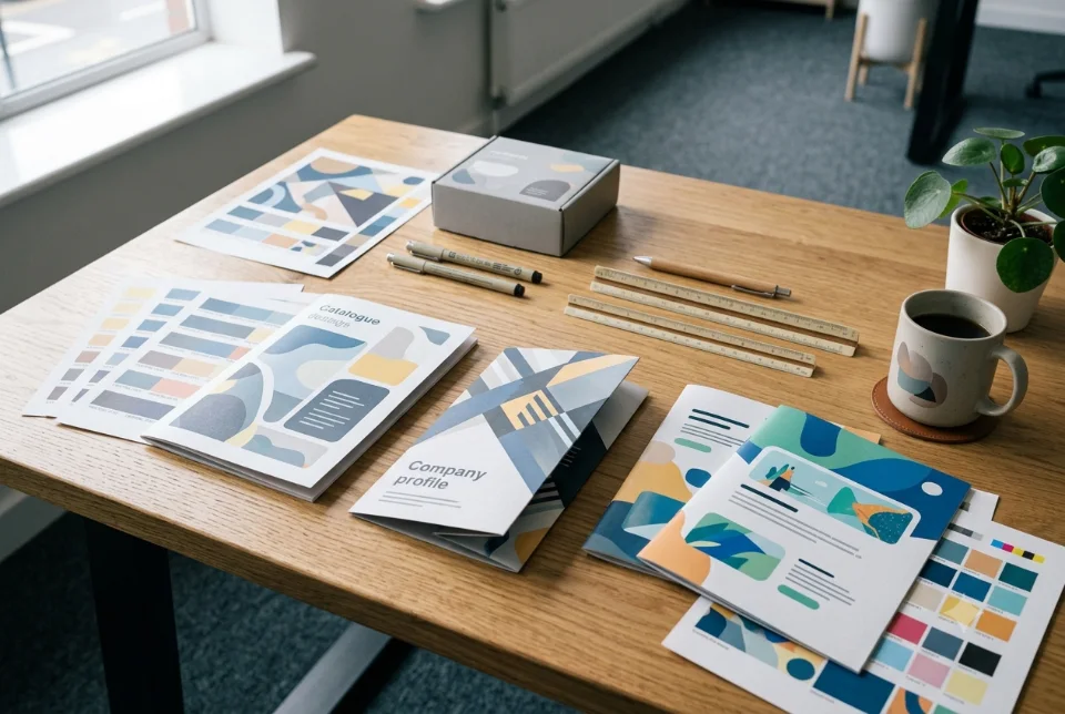
The most useful restaurant menu design tips are simple: group dishes into clear categories, write short honest descriptions, show prices quietly, use readable fonts with strong contrast, and print on paper that survives real use. A menu is a working tool, not a poster. Below are practical restaurant menu design tips for Indian restaurants, cafes, cloud kitchens and sweet shops, from layout to lamination to QR codes.
How guests actually read a menu
Most guests do not read a menu from top to bottom like a book. They glance at the page, look at the first few items, check the corners and any boxed or highlighted dishes, then scan down a column. They often look for something familiar, such as paneer or chicken, before trying anything new.
This means the top of each page and the start of each section get the most attention. Place dishes you most want to sell, and that also earn you a fair margin, where eyes land first, but do not hide the rest. If guests cannot find a simple dish quickly, they may feel lost and order the first thing they recognise.
Keep this behaviour in mind through every choice below. Your menu should make scanning easy, with obvious sections, steady spacing and no clutter fighting for attention.
Restaurant menu design tips for layout and categories
Good layout is mostly about order, and these restaurant menu design tips start there. Use categories that match how people think about a meal, and keep them in the sequence guests expect.
- Start with a short list of categories. Starters, soups, tandoor, main course, breads, rice and biryani, desserts and beverages work for many restaurants. Do not create twenty tiny sections.
- Keep related items together. Put all paneer dishes in one place instead of scattering them across pages.
- Limit the number of items. A very long list makes choosing harder and slows your kitchen. Remove items that are rarely ordered.
- Use white space. Space between sections is not wasted. It lets the eye rest and find the next heading.
- Align everything. Item names on the left and prices on one tidy edge look calmer than a mixed arrangement.
- Mark veg and non-veg clearly. Use the green and red dot beside every item, in the same position, on every page.
A cafe may need only one page, while a large family restaurant may need a folder. The principle stays the same: fewer choices per page, clearer sections.
Writing item descriptions that help
Among restaurant menu design tips, writing is often ignored. A good description tells a guest what is on the plate and what makes it different, in a line or two. "Paneer tikka" may need no explanation. "Smoked pepper paneer tikka with mint chutney" tells the guest something useful.
- Be specific. Name the main ingredient, the cooking style and one flavour note.
- Keep it short. Long paragraphs on a menu rarely get read.
- Be honest. Do not claim "homemade", "organic" or "fresh" unless it is true. Guests notice, and some claims can raise legal questions.
- Explain unfamiliar names. Regional dish names are lovely, but a few words of explanation help visitors and younger guests.
- Mention spice level or allergens where relevant. Notes such as contains nuts or mildly spicy build trust, as long as they are accurate.
Use the same style across the menu. If one item has a long story and the rest have none, the page looks uneven.
Want this done for you? Ragnar Studios handles Menu Card Design. See how it works or get a free quote.
Showing prices without hurting appetite
Prices are important, but they do not need to shout. Of all restaurant menu design tips, this one saves the most awkwardness. A long column of prices with dotted lines or bold numbers invites guests to compare costs before they think about food. A calmer approach is to place the price right after the description in the same size and weight as the text.
Many Indian menus use the plain number without the rupee symbol, which looks cleaner. Whichever you choose, be consistent. For half and full portions, show both in a tidy format, such as 180 / 320, with a small key at the top of the section. For add-ons and combos, keep the wording short.
Check that prices include or exclude taxes in the same way throughout, and state clearly if GST is extra. A small note at the bottom is enough. Guests dislike surprises on the bill.
Highlighting best sellers honestly
Of the restaurant menu design tips here, this needs the most honesty. Highlighting a few dishes is a sensible way to guide choice, but only highlight what is true. A small star, a box or a tag such as "chef's pick" can work when it is used for two or three dishes per page, not twenty.
- Base highlights on what you actually sell well, from your billing records.
- Choose dishes you can prepare consistently at peak hours.
- Do not label an item "bestseller" if it is not. Guests compare notes, and the claim loses meaning quickly.
- Rotate highlights with the season, such as monsoon snacks or festival specials, and update the menu when they change.
If everything is highlighted, nothing stands out. Restraint makes the few highlights work.
Photos or no photos
Among all restaurant menu design tips, the photo question causes the most debate. Photos help in some outlets and hurt in others. Quick-service restaurants, cloud kitchens and sweet shops often benefit, because guests want to see portion size and colour. Fine dining and bars usually prefer type-led menus that feel calm and premium.
If you use photos, they must be sharp, well lit and honest. A dish that arrives looking very different from the photo disappoints guests. Use fewer photos at a bigger size rather than many small ones. Keep the style consistent, with similar lighting and plates.
If you do not have good photos, do not force it. A clean typographic menu looks better than poor images. You can add simple icons or illustrations for sections, or plan a proper photo session later and update the menu.
Restaurant menu design tips for fonts and contrast in dim light
Many restaurants are dimly lit, so among the restaurant menu design tips this one is essential: a menu must stay readable when the light is low. Fashionable thin fonts on a dark, textured background look elegant on a screen but become a struggle at the table.
- Use dark text on a light background where you can. If you choose light text on dark, make the text slightly bigger and bolder.
- Choose clear fonts. Use one font for headings and one for body text. Avoid script fonts for item names.
- Keep sizes comfortable. Item names and descriptions should be readable at arm's length by older guests.
- Avoid text over busy images. Patterns and photos behind text reduce clarity.
- Test in real light. Print one copy and read it at your own table in the evening.
If your guests read Hindi or a regional language, give those names equal care, with a font that supports the script properly.
Paper, lamination and durability
A menu gets touched by many hands, sometimes with oily fingers, so these restaurant menu design tips on print matter. Plan for that from the beginning.
- Lamination protects against spills and wipes clean. Matt lamination reduces glare under lights, while gloss can reflect them.
- Thicker paper or card feels better and lasts longer than thin sheets. Ask your printer to show samples.
- Folders or spiral binding keep multi-page menus neat and make it easy to replace a single page.
- Table tents need a sturdy stock and a clean fold so they do not tip over.
- Keep spares. Print a few extra copies for busy days and festival seasons.
Before a large print run, ask your printer for a proof and check names, prices and colours. If you need design help, our menu card design services include print-ready files, and printing can be arranged on request. For more on getting artwork ready, see print file preparation guide.
QR menus: pros and cons
QR menus became common in India and are still useful, though they are not right for every guest and these restaurant menu design tips come with trade-offs.
- Pros: easy to update prices and items, no reprinting cost, simple to add photos, and handy for delivery and WhatsApp sharing.
- Cons: some guests have low battery, poor network or prefer paper; older guests may struggle; scanning breaks the table conversation; and a slow page frustrates people.
A practical approach is to offer both. Keep a printed menu for those who want it, and put a QR code on the table tent for the digital version. Make sure the digital menu loads fast, opens without installing an app, and is easy to read on a small phone. If your outlet also needs an online presence, our restaurant website design service can put the menu on your own website.
Updating your menu without chaos
Prices change, items go out of stock and seasonal dishes come and go. A menu that is hard to update becomes outdated, and outdated menus lead to awkward conversations at the table.
- Keep one master item list with names, descriptions and prices, and make every format from it.
- Decide who is responsible for approving changes.
- Use removable inserts or a separate specials card for temporary items.
- Reprint full menus on a schedule, not only when pages look worn.
- Replace old copies everywhere, including your delivery listings and WhatsApp catalogue, so guests do not see two different prices.
Designing the menu in a way that allows easy changes saves money. If you work with a designer, ask how small corrections are handled and how long they take. Our guide on how to brief a graphic designer can help you prepare.
A final restaurant menu design checklist
Before you send a menu to print or publish it online, run through this checklist of restaurant menu design tips.
- Are the categories clear and in a logical order?
- Is every item marked veg or non-veg consistently?
- Are descriptions short, accurate and free of unproven claims?
- Are prices aligned, complete and consistent with the bill?
- Are the highlighted items honest and few?
- Do the photos, if used, look real and sharp?
- Can an older guest read it in dim light?
- Is the paper, lamination or binding suited to heavy use?
- Does the QR code work on different phones, and does the page load quickly?
- Have two people checked every spelling and price?
If the answers are yes, you have a menu that helps guests decide and helps your staff serve. For help with the design, see our graphic design services, or share your item list with us and we will prepare a custom quote.
Frequently asked questions
Which restaurant menu design tips matter most for a small cafe?
Keep the list short, group items clearly, mark veg and non-veg consistently, and make text readable in dim light. Add a few honest highlights, use photos only if they are good, and print on sturdy or laminated stock. These basics help more than decoration does.
How many items should a restaurant menu have?
There is no fixed number, but fewer is usually better. A long list slows guests and your kitchen. Look at your sales records, remove items that rarely sell, and keep each category short enough to scan. Cafes often do well with one page, while larger restaurants may need several.
Should I show the rupee symbol on my menu?
It is a style choice. Many menus drop the symbol and show only the number, which looks cleaner. Whatever you pick, use it consistently on every page and format, and state clearly whether GST is included or extra so the bill does not surprise guests.
Are photos good for a restaurant menu?
They can be, if they are sharp, well lit and honest. Quick-service outlets, cloud kitchens and sweet shops often benefit, while fine dining and bars often prefer type-led designs. Weak photos hurt more than no photos, so use fewer and better ones.
Which fonts are best for a restaurant menu?
Choose clear, readable fonts with strong contrast against the background. Use one font for headings and one for body text, and avoid thin or script fonts for item names. Test a printed copy in your restaurant's evening light before printing the full run.
Is lamination necessary for menu cards?
It is not compulsory, but it helps menus survive spills and frequent handling. Matt lamination reduces glare, while gloss can reflect lights. Folders or spiral binding also protect multi-page menus. Ask your printer for samples and a proof before a large print run.
Should I use a QR menu instead of a printed menu?
Many outlets use both. QR menus are easy to update and cost nothing to reprint, but some guests prefer paper or have weak network or low battery. Offering a printed card along with a QR table tent is a practical middle path.
How often should I update my menu?
Update whenever prices or items change, and review the full menu at least when you change suppliers, seasons or festival offers. Keep one master item list so every format stays in sync, including delivery listings and WhatsApp catalogues. Fix wrong prices at once, because guests remember being charged more than the menu showed.
Can Ragnar Studios design and print my menu?
We design menus, table tents, QR cards and delivery flyers, and we can share print-ready files with your printer. Printing can be arranged on request and is quoted separately. Pricing for design is a custom quote after we see your items and formats, so send us your list on WhatsApp or the form.
Want a menu that is easy to read and easy to update? Share your item list and formats and we will prepare a custom quote: see our menu card design services in India.
Free quote
Tell us about your menu
Fill this short form and send it on WhatsApp. We reply with questions or a quote. Nothing is charged on the website.
- Takes about two minutes
- Goes straight to Ragnar Studios on WhatsApp
- Prefer email? Write to info@ragnarstudio.com
Ready to start Restaurant Menu Design Tips for Indian Owners?
Tell us what you need. We reply on WhatsApp with questions, next steps and a quote.