
Home / IT & Design Blog / Brochure Design Tips for Indian Businesses
Design & BrandingBrochure Design Tips for Indian Businesses
A brochure works when the reader finds what they need in seconds. These brochure design tips cover layout, images, bilingual text, print settings and PDF sharing.
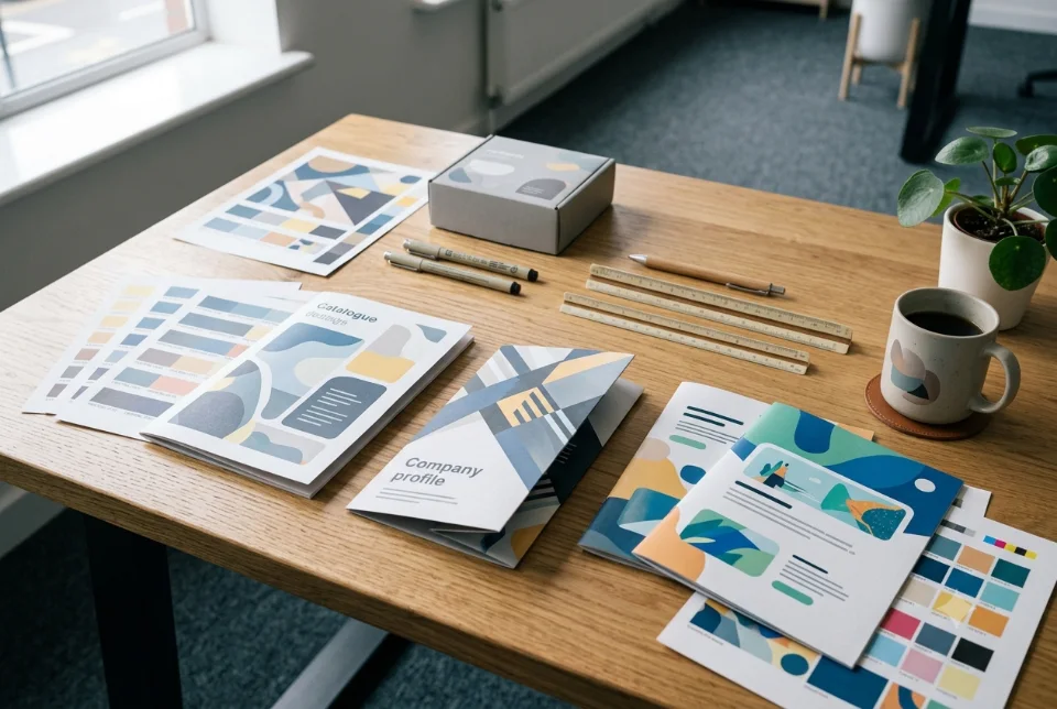
The most useful brochure design tips come down to a few habits: decide one goal for the brochure, put the most important message first, keep the layout clean with plenty of white space, use sharp photos, and prepare the file correctly for print or for sharing as a PDF. Whether you run a clinic, a coaching centre, a factory or a boutique, a brochure that is easy to scan and easy to act on will do more for you than one packed with every detail.
Start with one goal and one reader
Before choosing colours or templates, answer two questions. What should the reader do after reading, and who is the reader? A brochure for a school admission drive has a different job from a catalogue handed to dealers at a trade fair.
Pick one main action: call, visit, scan a QR code, message on WhatsApp, or request a quote. Then write the brochure so that every panel leads towards it. If you try to make one brochure do five jobs, it usually does none of them well. Most brochure design tips only work once this goal is clear.
Also decide how it will be used. A printed piece handed over at a counter can be short and visual. A PDF sent on WhatsApp to a buyer comparing options may need more detail.
Brochure design tips for choosing the right format
Format affects cost, folding and how the content flows. Common choices include:
- Single sheet (flyer). Good for a quick offer or event. One side for the hook, the other for details.
- Bi-fold. Four panels. Works well for a compact introduction to a business with a small range.
- Tri-fold. Six panels, a familiar choice at Indian print shops, and easy to hand out or place in a rack. Plan which panel the reader sees first, as the inside panels open in a set order.
- Booklet or catalogue. Multiple pages stapled or bound. Better for product ranges, projects, menus or a detailed company profile.
Match the format to the amount of content you really need. If you are forcing text into a tiny panel, move to a bigger format. If a booklet is half empty, shrink it. For a longer document about your whole business, see how to create a company profile PDF.
Brochure design tips for a clear visual hierarchy
Hierarchy means the reader can tell in a few seconds what is most important, what is next and what is detail. These steps help most:
- One clear headline per page or panel. It should say what the reader gets, not just the name of your company.
- Use size and weight to rank information. Headline largest, subheading smaller, body text smallest. Do not make everything bold.
- Group related things. Keep a product, its short description and its price together, with more space between groups than inside them.
- Limit fonts. Two font families are usually enough. Mixing five styles looks untidy and slows reading.
- Keep body text readable. As a rough guide, many printed brochures use body text of about 9 to 11 points, but test a printed proof, since font design changes how big text feels.
- Put the action where it is easy to find. Phone number, WhatsApp, website and address belong on the back panel, and often on the front as well.
A good test is to hold the brochure at arm's length. If you can still tell what the business does and what to do next, the hierarchy is working.
Use white space and a simple grid
New designers often fear empty space and fill every corner. In practice, white space is what makes a brochure feel organised and premium. Leave comfortable margins, usually a little wider than you think you need, and keep text away from folds and trim edges.
A simple grid, such as two or three columns with consistent margins, keeps the layout tidy. Align text and images to the same grid lines. When items are aligned, the brochure looks professional even if the design is simple.
Avoid putting text over busy photos. If you must, add a solid or lightly transparent block behind the text so it stays readable. Do not use light grey text on a white page; it can disappear on cheaper paper.
Choose images, icons and colours with care
Images do much of the selling in a brochure, so quality matters more than quantity.
- Use your own photos where you can. Real photos of your product, premises or team build more trust than obvious stock images.
- Keep the style consistent. Similar lighting, similar angles and a similar colour feel make the pages look like one set.
- Crop with purpose. Show the product or the person clearly. Avoid heavily stretched or squeezed pictures.
- Use icons sparingly. Small icons can help with lists of features or services, as long as they share one style.
- Stay within your brand colours. One main colour, one accent and a neutral are usually enough. If you have not defined them yet, our brand identity guide explains how.
Remember that colours on a phone or laptop screen can look different from the printed result. Screens mix light, while printers mix inks. For colour-sensitive work, ask your printer for a proof before the full run.
Brochure design tips for writing short, useful copy
Brochure copy should be scannable. People read headlines, captions and lists first, and detailed paragraphs only if they are interested.
- Write benefits, not only features. Say what the customer gets, in plain words.
- Use short sentences and short paragraphs.
- Use real details: services offered, areas covered, timings, how to order, how payment works.
- Include a clear next step, such as "Call or WhatsApp us for a quote".
- Proofread names, numbers, prices and spellings twice, and ask someone else to check as well.
Avoid claims you cannot prove, such as "best in India". Specific facts, such as what is included in a service, are more convincing. If your brochure shows prices, remember that they may change, so add a short note such as "prices subject to change" or print a separate price insert.
Handle bilingual and regional language content
For many Indian businesses, one language is not enough. A brochure may need English plus Hindi, Marathi, Gujarati, Tamil, Bengali or another regional language. Done well, it makes more customers feel welcome. Done badly, it looks crowded. A few brochure design tips for bilingual layouts:
- Choose fonts that support both scripts. Check that every character, including conjuncts and matras, shows correctly in the final file.
- Give each language its own space. Side-by-side columns, or the same panel repeated in two languages, are easier to read than mixing both in one paragraph.
- Allow extra room. Text length changes after translation, so do not design to the last millimetre.
- Match the visual weight. If the English heading is bold and large, the other language should be treated the same way.
- Get a native speaker to proofread. Machine translation can produce awkward or wrong wording, especially for product and legal terms.
Another approach is to make two separate versions, one per language, and share the right one on WhatsApp or print it for the right area. This keeps the layout clean.
Print-ready brochure design tips: bleed, resolution and colour
Many print problems come from files that were not prepared correctly. These are the basics to confirm with your printer, because requirements differ between presses.
- Bleed. If a colour or image runs to the edge, extend it slightly beyond the trim line. A common bleed is about 3 mm, but ask your printer for their exact figure.
- Safe margin. Keep important text and logos inside a margin away from the trim edge and folds, so nothing is cut off.
- Resolution. Images for print are commonly supplied at around 300 dpi at the final size. A photo copied from a website or WhatsApp is usually too small and will look blurry in print.
- Colour mode. Designs for screens use RGB, while printing presses use CMYK. Convert your final file to the profile your printer asks for and check that colours still look right.
- Fonts and links. Embed fonts or convert them to outlines, and include all linked images, so the file does not change at the print shop.
- Folds and panel sizes. On a tri-fold, one inside panel is often slightly narrower so it can fold in. Use the printer's template.
- Paper and finish. Matte, gloss, thickness and lamination change the look and the cost. Ask for sample stock and a printed proof for larger runs.
Before you approve a big print order, ask for a proof, check spellings, phone numbers and the order of panels once more, and only then print the full quantity.
Sharing your brochure as a PDF
In India, most brochures now travel on WhatsApp, email and Google Drive as often as they travel by hand. A digital version needs its own care.
- Export a screen-friendly PDF. It does not need bleed or crop marks, and the file size should be small enough to send on a mobile connection.
- Make text readable on a phone. Avoid tiny fonts, and consider a single-page-per-screen layout for mobile readers.
- Use clickable links. Add tappable phone, WhatsApp, email and website links.
- Name the file properly. Use a clear name such as your business name plus the product line, rather than a default file name.
- Keep two files. One for print (with bleed and high resolution) and one for sharing on screen.
Include a QR code on printed brochures if you want people to jump to your website, catalogue or WhatsApp chat. Test it on more than one phone before you print, and make it big enough to scan from a normal distance.
Common brochure mistakes to avoid
- Cramming in too much text because the paper "has space".
- Using low-quality or stretched photos.
- Leaving out contact details, or printing an old phone number.
- Ignoring the fold, so that a headline or face is cut in half.
- Mixing too many fonts and colours.
- Skipping the printed proof.
- Making the brochure about the company and not the customer.
If you would rather hand this over, Ragnar Studios offers brochure and catalogue design, and you can also look at our broader graphic design services. Pricing for design work is a custom quote after we understand the number of pages, content, images and revisions you need.
A quick checklist before you finalise
Use this short list as a last check of your brochure design tips before sending the file to a printer or to customers.
- One clear goal and one clear call to action.
- A readable headline on every page or panel.
- Sharp photos, consistent style and brand colours.
- Correct phone, WhatsApp, address and website.
- Bilingual text proofread by a native speaker, if used.
- Bleed, safe margin, 300 dpi images and the right colour mode confirmed with the printer.
- A printed proof checked, and a separate small PDF made for sharing.
A brochure does not need to be fancy to work. If it is clear, honest and easy to read, it will already be ahead of most.
Frequently asked questions
What are the most important brochure design tips for beginners?
Start with one goal and one call to action, keep the layout simple with plenty of white space, use a clear headline hierarchy, choose sharp photos and limit yourself to two fonts. Then check print requirements such as bleed and resolution with your printer, and always look at a printed proof before the full run.
What size should a brochure be in India?
Common choices are A4 flat sheets folded into bi-fold or tri-fold formats, and A5 or A4 booklets. The right size depends on content, budget and how it will be handed out. Ask your printer for their standard sizes and fold templates before you start designing, so the layout fits.
What is bleed in brochure design?
Bleed is extra artwork that extends past the final trim line so there is no thin white edge if the cut is slightly off. A common bleed is about 3 mm, but printers differ, so confirm the exact requirement. Keep important text inside a safe margin away from the edge.
What resolution do images need for a printed brochure?
Print images are commonly supplied at around 300 dpi at their final printed size. Pictures saved from websites or WhatsApp are usually too small and look soft in print. Use original camera files or high-resolution images, and ask your printer if they have a different requirement.
How do I design a bilingual brochure in English and Hindi or another language?
Pick fonts that support both scripts, give each language clear space, leave extra room for translated text and treat headings the same way in both. Have a native speaker proofread the final file. If the layout feels crowded, consider making a separate version for each language.
Should I send my brochure as a PDF on WhatsApp?
Yes, it is a common way to share brochures. Export a lighter screen version with readable text and clickable phone, WhatsApp and website links, and give the file a clear name. Keep the print version separate, because it needs bleed and higher-resolution images.
How many pages should a business brochure have?
There is no fixed number. A tri-fold or four-page piece is enough for a small range of services, while a product catalogue or company profile may need more pages. Include only what helps the reader decide, and move extra detail to your website or a separate price list.
How much does brochure design cost in India?
Costs vary widely with page count, content, photography, illustration and revisions, so treat any market range as a rough guide. Printing is a separate cost from design. Ragnar Studios gives a custom quote after understanding your requirements, number of pages and use.
Need a brochure or catalogue designed and print-ready? Share your content and goals with Ragnar Studios on the brochure and catalogue design page for a custom quote.
Free quote
Tell us about your brochure or catalogue
Fill this short form and send it on WhatsApp. We reply with questions or a quote. Nothing is charged on the website.
- Takes about two minutes
- Goes straight to Ragnar Studios on WhatsApp
- Prefer email? Write to info@ragnarstudio.com
Services that help with this.
Brochure & Catalogue Design
Ragnar Studios designs brochures, catalogues, price lists and flyers as print-ready files and as light PDFs for WhatsApp.
Explore →Company Profile Design
We turn your business details into a clear, branded company profile as a print-ready PDF or a presentation deck.
Explore →Graphic Design
Ragnar Studios designs posters, flyers, banners, brochures, visiting cards, packaging and social creatives for Indian businesses.
Explore →More from the IT & design blog
Ready to start Brochure Design Tips for Indian Businesses?
Tell us what you need. We reply on WhatsApp with questions, next steps and a quote.