
Home / Blog / Font Pairing Guide
Design & BrandingFont Pairing Guide: How to Choose Typefaces for Your Brand and Website
Good font pairing means choosing two typefaces, one for headings and one for reading, that look related but clearly different in role. Keep to two families, contrast them on one trait such as serif against sans, and test them on a real phone before you commit.
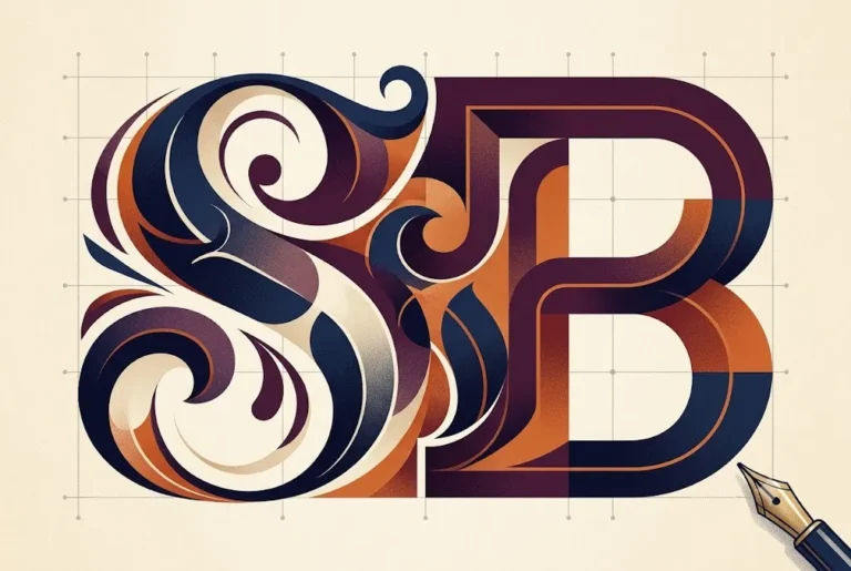
Font pairing is one of the quickest ways to make a brand look finished or look careless. Most small business sites do not fail because of a bad typeface. They fail because three or four fonts compete on one page, weights are random and nobody wrote down which font does what.
This guide explains font pairing in practical terms: the rules that hold up, safe serif and sans combinations, how variable fonts and Google Fonts affect speed, what to check on licensing, and how to pair Latin and Devanagari type for Hindi and bilingual material. It is written for owners, marketers and anyone briefing a designer. If you are still at the stage of choosing a palette and typefaces together, start with our note on how to choose brand colours and fonts.
Typography also matters right now for a technical reason. Fonts are often among the heaviest files a page loads, and they influence layout shift and text visibility, which feed into the page experience metrics we cover in Core Web Vitals for small business websites. A good pair that loads badly is still a bad pair.
Why font pairing shapes how a brand is read
People read tone before they read words. A heading in a sharp geometric sans says modern and direct. The same words in a soft serif say established and warm. Font pairing is how you control that first impression and keep it steady from your logo to your invoice.
A clear pair also does a practical job: it shows hierarchy. The reader should be able to tell a heading from body text from a caption without thinking. When two fonts have a defined role each, the page is easier to scan, and your designers and developers stop guessing.
Consistency is the real prize. A mediocre pair used everywhere looks more professional than a brilliant pair used differently on every page. That is why typography belongs in your brand guidelines, not in individual designers' heads.
Six font pairing rules that hold up
- Use two families, three at most. One for headings, one for body. A third is only for a rare accent such as a script on invitations.
- Contrast one trait, share another. Pair a serif with a sans, or a heavy display face with a quiet text face. Avoid two fonts that are almost alike, because they look like a mistake.
- Match proportions. Check the x-height (the height of lowercase letters). If one font looks much larger at the same size, the pair feels uneven.
- Match mood. A playful rounded font beside a stiff formal serif will argue with itself.
- Pick the body font first. It carries most of the reading, so choose the one that is comfortable at 16 to 18 pixels, then find a heading partner.
- Use weight and size for hierarchy. Often one family in several weights does more than a second family.
Many strong brands use a single family with a serif or display companion only for the largest headings. If in doubt, simplify.
Serif and sans font pairing combinations that work
The table lists reliable pairs available on Google Fonts. Treat them as starting points, then test them with your own copy.
| Heading | Body | Feels like |
|---|---|---|
| Playfair Display | Source Sans 3 | Editorial, premium, calm |
| DM Serif Display | DM Sans | Friendly, modern, clean |
| Fraunces | Inter | Warm with a technical edge |
| Lora | Poppins | Approachable, retail friendly |
| Montserrat | Merriweather | Confident, trustworthy |
| Space Grotesk | Inter | Tech, startup, product |
Why do these work? Each pair has one clear difference: serif against sans, or display against text. They also share a basic structure, such as similar proportions or a common design lineage. Check each family's page for the weights and scripts you need before you plan around it.
A sans heading with a sans body can work too, provided the difference is obvious in weight, width or size. Two near identical sans fonts, on the other hand, are the most common beginner mistake in font pairing.
Choose a font pairing by business type
- Clinics, law and finance: a steady serif heading with a clear sans body signals care and trust.
- Restaurants and hospitality: a characterful display heading with a very readable text face, since menus are read in dim light.
- Schools and coaching institutes: a friendly sans pair with generous size, as parents of all ages read it.
- Tech and SaaS: one neutral sans in several weights, with a mono face only for code or numbers.
- D2C and retail: a distinctive heading font that echoes the logo, with a plain body font so product details stay clear.
Take the personality from your brand identity, not from what is trending. If your logo already uses a typeface, either reuse it for headings or choose a partner that complements it. Our logo design tips cover how the wordmark and the type system should relate, and what is changing in logo type is in logo design trends for 2027.
Build a type scale around your font pairing
Once you have a pair, set the sizes once and reuse them. A simple scale for the web looks like this.
| Role | Typical size | Notes |
|---|---|---|
| Body text | 16 to 18 px | Line height about 1.5 to 1.7 |
| H1 on desktop | 40 to 56 px | Shrink to roughly 30 to 36 px on phones |
| H2 | 28 to 36 px | Tighter line height, about 1.2 to 1.3 |
| Caption or label | 12 to 14 px | Use weight, not tiny size, for emphasis |
These are working ranges, not rules from a standard. Set a line length of about 45 to 75 characters for body text, because very long lines tire the eye. Use CSS functions such as clamp() so headings scale smoothly between phone and desktop widths.
Keep contrast high. Thin weights in light grey look elegant in a mockup and unreadable outdoors. Our guide to accessible colour contrast shows how to check text against its background.
Want a typography system you can reuse? Ragnar Studio's can set up font pairing, sizes and rules inside your brand guidelines, for print and web, in English and Hindi. See brand guidelines design or get a free quote.
Variable fonts and font pairing: fewer files, more control
A variable font packs a range of weights, and sometimes widths or slants, into one file. Instead of loading regular, medium, semibold and bold as four files, you load one and choose any weight in between with CSS.
The web.dev font guidance notes that a variable font can replace several files, which helps most when a site uses many variations. It also warns that a variable file can be larger than one static font, so if you only need regular and bold, two static files may be lighter. Count what you really use.
- Use variable fonts when your design needs three or more weights of one family.
- Use static files when you need only regular and bold.
- Do not load axes you never use. On Google Fonts, request only the weight range you need.
- Test rendering on an older Android phone, since that is where problems appear first.
Variable fonts also make font pairing easier to tune. If the body face looks slightly heavy beside a light heading, a weight of 380 instead of 400 can fix it without a new file.
Google Fonts, self-hosting and page speed
Fonts are a performance decision as much as a style decision. Each family and weight adds a request and bytes, and slow font loading causes either invisible text or a visible jump when the real font arrives.
The web.dev font best practices guide gives the main levers:
- font-display: use
swapfor distinctive brand or heading text so words appear at once, though the late font can cause a visible jump.optionalis the most performant choice and suits body text when speed matters most. - Subsetting: serve only the characters and scripts you need. Per-language files can use
unicode-rangeso the browser downloads only what a page requires. - Preload sparingly: preloading helps the one or two most important fonts but competes with other resources if overused.
- size-adjust: tune the fallback font's size so the swap causes less layout shift.
- Self-hosting: the speed difference against third-party hosting is not clear cut, so it is no automatic win. If you self-host, serve WOFF2 from a CDN over HTTP/2 and subset the files yourself.
The Google Fonts getting started page shows the display parameter, such as &display=swap, and explains that modern browsers pick the script subsets they need. For many small sites the simplest sound font pairing setup is Google Fonts with display swap and two to three weights. If you serve visitors in the EU, note that in January 2022 the Munich Regional Court (LG München I, case 3 O 17493/20) awarded a visitor 100 euros because a site passed their IP address to Google by loading Google Fonts from Google's servers. That is one reason many EU-facing sites self-host, so ask your adviser which route fits.
If your scores suffer, our website speed optimization tips and the speed optimization service cover the wider checklist.
Font licensing: what to check before you commit
A font on your computer is not necessarily a font you may use in a logo, on a website and in print. Licences differ by use, so check before the brand is printed on thousands of items.
| Source | Usual terms | Check |
|---|---|---|
| Google Fonts | Open source licences, commonly the SIL Open Font License | Read the licence on each family page |
| Paid foundries | Separate licences for desktop, web, app and print | Page views, number of users, logo use |
| Subscription services | Access while you subscribe | What happens to your site if you cancel |
| Free font sites | Often personal use only | Commercial use in writing |
Keep the licence files with the brand folder. If a freelancer or agency chose the font, ask for the licence name and who holds it, so the font is not lost when the project ends. This is a small detail that avoids expensive surprises later, and it is one more reason to record your typefaces in the brand guidelines.
Devanagari font pairing for Hindi and bilingual brands
For Indian brands, font pairing often means matching a Latin typeface with a Devanagari one. This is harder than it looks, because Devanagari has a continuous top line (the shirorekha) and marks above and below the letters, so it needs more vertical room and its size feels different from Latin at the same point size.
- Give it more line height. Body text in Devanagari usually needs a taller line than Latin, often about 1.6 to 1.8, so marks do not collide.
- Match the feel, not the shapes. Pair a humanist Latin sans with a humanist Devanagari sans, and a high contrast Latin serif with a serif style Devanagari.
- Check weight against weight. A bold Latin heading beside a light Devanagari one looks like two brands.
- Test real Hindi copy, not placeholder text, including conjunct letters and matras.
- Avoid faking bold or italics. Many Devanagari fonts have no true italic. Use weight or colour for emphasis.
On Google Fonts there are several families with Devanagari support, among them Noto Sans Devanagari, Noto Serif Devanagari, Hind, Mukta and Tiro Devanagari Hindi. Poppins also includes a Devanagari subset, which makes it a handy option when you want one family across both scripts. Always open the specimen page to confirm the scripts and weights before planning around a font.
Load the Devanagari subset only on pages that use it, so English pages stay light. Ragnar Studio's works with English and Hindi copy, and a bilingual type system is something we set up in brand guidelines work.
How to test a font pairing before you commit
- Use real content. Paste your actual headline, a paragraph, a price and a button label, not lorem ipsum.
- Check small sizes. View body text on a mid-range phone in daylight.
- Check the numerals. Prices and dates should be clear, with the right style of figure for tables.
- Check the awkward characters: the rupee sign, quotes, ampersand and any accented or Devanagari letters you need.
- Squint test. Blur your eyes. You should still see headings, then body, then captions.
- Measure the cost. Note the font file sizes and run PageSpeed Insights before and after.
- Ask someone outside the project which text feels most trustworthy.
If a font pairing needs constant adjustment to look right, it is probably the wrong pair. Choose a more forgiving one. A well chosen pair also supports subtle motion and interface touches, which we discuss in micro-interactions and motion design for websites.
Font pairing mistakes to avoid
- Using four or five fonts because each looked nice alone.
- Pairing two similar fonts, so the difference looks accidental.
- Loading six weights when the design uses two.
- Thin light text on a coloured background.
- Choosing a font that has no bold, no numerals you like or no Hindi support, then patching it with another one.
- Leaving the pair out of the brand guidelines, so every new designer chooses again.
Fix these font pairing mistakes and you have solved most typography problems on small business sites.
Frequently asked questions
What is font pairing?
Font pairing is choosing two typefaces that work together, usually one for headings and one for body text. They should differ clearly in one trait, such as serif against sans, while feeling like they belong to the same brand.
How many fonts should a website use?
Two families are enough for most sites, and three is the practical limit. Use weights and sizes of those families to build hierarchy rather than adding new fonts.
What is the safest serif and sans font pairing?
A calm serif heading such as Playfair Display or Lora with a clean sans body such as Source Sans 3 or Inter is a dependable start. Test it with your own copy on a phone before you finalise.
Do variable fonts make a website faster?
Often, when you need three or more weights of one family, because one file replaces several. If you only need regular and bold, two static files can be smaller. Measure the file sizes for your case.
Are Google Fonts free for commercial use?
Most Google Fonts are open source under licences such as the SIL Open Font License, which allows commercial use. Check the licence on each family page, and keep a record of it with your brand files.
How do I do Devanagari font pairing with a Latin font?
Pick Latin and Devanagari families with a similar mood and weight, give Devanagari a taller line height, and test with real Hindi text. Families such as Noto Sans Devanagari, Hind and Mukta are common starting points on Google Fonts.
How do fonts affect Core Web Vitals?
Slow fonts can delay text and cause layout shift when the real font replaces the fallback. Use font-display, subset your files, load only needed weights and tune the fallback with size-adjust. See our Core Web Vitals guide.
Should my logo font match my website font pairing?
They should feel related, not necessarily identical. Logos often use a custom or licensed wordmark, so choose website fonts that echo its mood and proportions, and record the rule in your brand guidelines.
Settle on two families, give each a clear job, test them on a phone with real copy, and write the rules down. If you would like a designer to build the system for you, talk to Ragnar Studio's on WhatsApp +91 92865 18510 or at info@ragnarstudio.com.
Free quote
Tell us about your project
Fill this short form and send it on WhatsApp. We reply with questions or a quote. Nothing is charged on the website.
- Takes about two minutes
- Goes straight to Ragnar Studio's on WhatsApp
- Prefer email? Write to info@ragnarstudio.com
Services that help with this.
Brand guidelines
Fonts, colours and rules your team can follow.
Explore →Logo design
A wordmark and type that work across print and web.
Explore →Website speed optimization
Lean font loading and faster pages.
Explore →UI and UX design
Readable type systems for sites and apps.
Explore →More from the blog
Ready to start your project?
Tell us what you need. We reply on WhatsApp with questions, next steps and a quote.