
Home / Blog / Micro Interactions
Design & BrandingMicro Interactions and Motion Design for Websites: A Practical Guide
Micro interactions are the small, single-purpose responses a page gives to what a visitor does: a button that presses down, a field that confirms, a loader that shows progress. Done well, they make a site feel clear and trustworthy; done badly, they slow it down and make some visitors unwell.
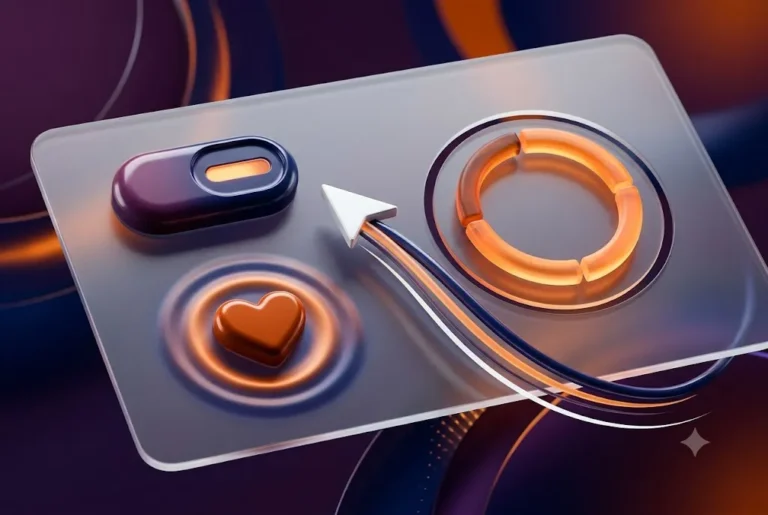
Motion is one of the easiest things to add to a website and one of the easiest to get wrong. Libraries make it a few lines of code, so many sites end up with sliding cards, bouncing icons and scroll effects that nobody asked for. The question to ask before every animation is simple: what is this telling the visitor?
That is the heart of good micro interactions. Each one has a job, such as confirming a tap, showing that something is loading, or pointing to what changed. This guide covers the anatomy of micro interactions, the most useful types, timing and easing numbers to start from, the performance cost, and how to respect visitors who ask their device for less motion. It is written for business owners briefing a designer and for developers who want a checklist.
If your site needs a design review, our team works on this daily through UI/UX design and website design and development.
What micro interactions are, and what they are not
The term was popularised by designer Dan Saffer, who describes four parts: a trigger (a tap, a hover, a system event), rules (what happens), feedback (what the visitor sees or feels) and loops and modes (what repeats or changes over time). You do not need to memorise the model, but it is a handy test. If you cannot name the trigger and the feedback, you probably have decoration, not micro interactions.
Everyday examples include:
- A button that changes shade on hover and sinks slightly when pressed.
- A form field whose border turns green with a tick when the email looks valid.
- A heart icon that fills when you save a product.
- A pull-to-refresh spinner or a skeleton screen while content loads.
- A toast message saying "Added to cart" with an undo link.
Page transitions, hero animations and scroll storytelling belong to motion design more widely. They can be lovely, but they are bigger and carry more risk. Start with the small ones, because they carry the most value for the least cost.
Why micro interactions matter for business websites
A website without feedback feels uncertain. Did my form send? Did the button register? Is the page frozen? Visitors who are unsure tap twice, leave, or call you to ask. Clear feedback reduces that doubt, and small touches of polish also signal care.
Be realistic about the claims, though. There is no magic percentage uplift to quote, and any figure you see online depends on a specific site and test. What you can do is measure your own: form completion rate, add-to-cart rate and support calls before and after a change. Our guide to UI and UX design mistakes to avoid lists the cases where missing feedback costs the most.
In India, many visitors browse on mid-range Android phones with variable mobile data, so animations must be light. The best ones cost almost nothing to load and make the page feel faster than it is.
Six micro interactions every business site should get right
| Type | Job it does | Good example |
|---|---|---|
| Hover and focus | Shows what is clickable | Link underline grows, button lifts |
| Press feedback | Confirms the tap | Button scales to 0.97 for an instant |
| Form validation | Guides correction | Inline message under the field |
| Loading state | Shows progress | Skeleton screen, button spinner |
| Success and error | Closes the loop | Tick and message after submit |
| Toggles and menus | Shows state change | Switch slides, menu eases open |
Treat hover as a bonus, never as the only signal. Touch screens have no hover, and keyboard users need a visible focus state. Whatever happens on hover should also happen on focus, a point our website accessibility checklist covers too.
Loading, success and error states: the micro interactions people notice most
If you only improve one area, improve feedback states. They are where visitors are most anxious.
- Loading: for anything longer than a blink, show something. Nielsen Norman Group's long-standing rule of thumb is that 0.1 second feels instant, one second keeps the flow of thought and around ten seconds is the limit of attention. Use a button spinner for short waits and a skeleton screen for content areas.
- Success: say what happened in words, not only with colour. "Message sent. We reply within one working day" beats a green flash.
- Error: put the message next to the problem, keep the visitor's typed data, and explain how to fix it. Do not rely on red alone.
- Disabled buttons: if a button is disabled, show why. A greyed-out Submit with no explanation is a common source of lost enquiries.
- Undo: where an action is easy to regret, offer undo instead of a confirmation pop-up.
Colour choices for these states need enough contrast; see our guide to accessible colour contrast.
Timing and easing for micro interactions: numbers to start from
There is no official standard, but design systems and practitioners have settled on ranges that feel right. Treat these as starting points and test them on real phones.
| Motion | Starting duration | Easing |
|---|---|---|
| Hover, focus, press | 100 to 200 ms | ease-out |
| Toggles, small menus | 150 to 250 ms | ease-in-out |
| Modals, drawers | 200 to 350 ms | ease-out in, ease-in out |
| Large layout moves | 300 to 500 ms | ease-in-out |
The pattern behind the numbers: things that appear should decelerate (ease-out), things that leave should accelerate (ease-in), and movement across the screen should do both. Keep exits shorter than entrances. Avoid linear easing for movement, because nothing in the physical world moves that way, and avoid bounce on a serious site such as a clinic or law firm.
A good habit is to build every micro interaction at normal speed, then reduce the duration by a quarter. If it still reads clearly, keep the faster version. Speed is a feature, and long animations make repeat users wait.
Not sure which micro interactions your site needs? Ragnar Studio's can review your key pages and suggest a short list of changes that are light on load time. See UI/UX design or contact us.
The performance cost
Animation is code running on the visitor's phone, so it shares a budget with everything else. Google's web.dev guidance is clear: where possible, restrict animations to transform and opacity, because browsers can handle those without recalculating layout or repainting. In its own test, animating top and left dropped about half the frames, while the transform version dropped about one percent (web.dev animations guide).
- Move with transform: use
translateandscalerather than changing width, height, margin or top. - Avoid animating shadows and blur on large areas. Paint costs are higher for these effects.
- Use will-change sparingly: promote an element to its own layer only when you see a real problem, then remove the hint afterwards.
- Do not load a heavy library for a hover effect. Plain CSS transitions handle most micro interactions in a few lines.
- Keep Lottie and video files small and lazy-load them. A 500 KB animation for a tick mark is poor value.
Motion also touches your Core Web Vitals. Layout shifts caused by elements that push other content around as they appear count against CLS, and heavy scripts hurt INP, where Google's good threshold is 200 milliseconds or less. Our notes on improving INP and Core Web Vitals explain how to measure. A micro interaction that delays the response to a tap has defeated its own purpose.
Reduced motion: make micro interactions accessible
Some visitors get dizziness, nausea or headaches from on-screen movement, particularly large movement such as parallax and zooming. Operating systems let them switch on a reduce-motion setting, and websites can read it with the CSS media query prefers-reduced-motion.
web.dev recommends removing non-essential movement for these users. Small feedback cues, such as a fade or a colour change, usually remain safe. In practice:
- Wrap decorative animation in
@media (prefers-reduced-motion: no-preference), or switch it off inside areduceblock. - Replace big movement with a fade or an instant colour change, not nothing at all.
- Stop looping animation, auto-playing background video and parallax.
- If you drive animation with JavaScript, listen for changes to the setting yourself, because only CSS animations update automatically.
On standards: WCAG 2.3.3, Animation from Interactions, is a Level AAA criterion and the W3C lists the reduced-motion media query as a sufficient technique for it (technique C39). Separately, WCAG 2.2.2, Pause, Stop, Hide, is Level A and applies to content that moves automatically for more than five seconds alongside other content, so carousels and animated banners need a pause control. Ask your developer to check both against your site; the accessibility checklist gives the wider context.
Where to use motion, and where to leave a page still
A calm page with a few well-placed micro interactions will beat a busy one. Use this as a filter.
- Use motion to confirm an action, show a state change, direct attention to something new, or explain how two screens relate.
- Avoid motion on long reading text, on forms while people type, and on anything critical such as prices or legal text.
- Be careful with entrance animations. Content that fades in on scroll can hide text from visitors who scroll quickly and can cause layout shifts. Keep the distance small and the delay short, or skip it.
- Do not hide content behind hover. It excludes touch and keyboard users.
- Match the brand. A children's brand can be playful; a law firm should be quiet and exact.
Motion also needs to fit the layout. If you are using card layouts, see our bento grid design guide for how to keep hover and reveal effects consistent across a grid.
A simple workflow for planning micro interactions
- List the key moments. Walk through your top three journeys, such as enquiry, checkout and booking, and note every point where the visitor waits, decides or finishes.
- Write the job of each. One sentence: "Confirms that the form was sent." If you cannot write it, drop the animation.
- Design the states. Default, hover, focus, active, loading, success, error and disabled. Designers often forget focus and error.
- Prototype the timing. Use the table above, then test on a real mid-range phone.
- Build in CSS first. Reach for JavaScript only when CSS cannot do it.
- Test with reduced motion on and with the keyboard only.
- Measure. Watch form completions, add-to-cart rate and Core Web Vitals for two to four weeks.
This fits naturally into a normal project; our website design process shows where interaction design sits between wireframes and development.
Common mistakes
- Animating everything. When every element moves, nothing stands out.
- Slow, theatrical timing. Anything over half a second on a frequent action feels like lag.
- Relying on colour alone. Red and green mean little to colour-blind visitors; add text or an icon.
- Ignoring reduced motion. This is the most common accessibility miss on animated sites.
- Hover-only controls. They vanish on phones.
- Heavy assets for small effects. Check file sizes before you ship.
- No fallback when JavaScript fails. The core action should still work.
If your site already has some of these, a focused review is often cheaper than a redesign. See UI/UX design company in India for how we work, or compare pricing options.
Frequently asked questions
What are micro interactions in web design?
Micro interactions are small, single-purpose responses to a visitor's action, such as a button press, a validated form field or a loading spinner. Each has a trigger, rules, feedback and sometimes a loop. Their job is to make the state of the page clear.
How long should a website animation last?
For most micro interactions, start with 100 to 250 milliseconds, and up to 300 to 500 milliseconds for larger moves such as drawers and layout changes. These are common design ranges rather than an official standard, so test them on real phones.
Do micro interactions slow down a website?
They can, if they use heavy libraries, large files or properties that force layout and paint. Animating transform and opacity, using plain CSS where possible and keeping assets small keeps the cost low.
What is prefers-reduced-motion and do I need it?
It is a CSS media query that reads a device setting where the user asks for less motion. You should support it, because large movement can cause dizziness or nausea for some people. Remove decorative motion and keep simple feedback such as fades.
Which CSS properties are best for animation?
Transform and opacity are the safest, because browsers can animate them without recalculating layout. Avoid animating width, height, top, left or margin, and use shadow and blur effects sparingly on large areas.
Should every button have a hover animation?
A subtle hover and a clear focus state are good practice, but they must never be the only signal, because touch screens have no hover. Keep hover effects short and consistent across the site.
Can I add micro interactions to a WordPress or Shopify site?
Yes. Most can be done with a few lines of CSS in your theme or builder, and some page builders include basic motion options. Keep the number small and test speed afterwards; our WordPress development and Shopify development teams can add them cleanly.
How much does it cost to add micro interactions to my website?
It depends on how many states and pages are involved. Simple hover, form and loading touches can be part of a normal build, such as our ₹5,999 / $139 five-page website, while custom animation systems are quoted separately. Message us on WhatsApp at +91 92865 18510 for a quote.
The best micro interactions are the ones visitors barely notice, because everything simply feels clear. Choose the three moments that matter most on your site, give each a clear job, a short duration and a reduced-motion fallback, then measure the result. When you want a hand, start a conversation on our contact page.
Free quote
Tell us about your project
Fill this short form and send it on WhatsApp. We reply with questions or a quote. Nothing is charged on the website.
- Takes about two minutes
- Goes straight to Ragnar Studio's on WhatsApp
- Prefer email? Write to info@ragnarstudio.com
Services that help with this.
UI/UX design
Clear states, feedback and motion planned around your users.
Explore →Website design and development
Fast, accessible sites built for phones first.
Explore →Website redesign
Refresh an older site without losing what works.
Explore →Speed optimization
Keep animation light and pages fast.
Explore →More from the blog
Ready to start your project?
Tell us what you need. We reply on WhatsApp with questions, next steps and a quote.